MOUNTED PROTOTYPES


My final prototypes for the internet-based elements of the brief are completed and mounted ready for submission and client presentation. A clearer look at each is provided here:


I felt that it would be appropriate to make mock-ups depicting their use as they would be seen, and using the iMac allowed the images to open in a browser, in this case Google Chrome, to give the clearest indication of their suitability and impact. Rather than just showing them how they'd look on the screen, I included the whole of the computer too so that the most complete image possible was displayed. I am pleased with the designs of these web elements, and feel that they meet the client's requirements as well as their opinions expressed later on within the project. They provide a clean and concise service to the user and I feel that navigation would be easy, as would finding all the required information. They also accompany the annual report design, using the same design style to ensure continuity with all the media involved.


This is the part of the project that I am happiest with and the one with which I best displayed my work, and I am grateful to have worked with Our Happy Place in order to produce a printed piece for a live brief. This is one of the pieces of work that I am most proud of and one which I will include in my portfolio for a long time, and the experiences of client work, meeting deadlines and printing have provided valuable insights and challenges that will benefit me as I move forward into a career post-graduation.

FINAL PROTOTYPE


This is the final prototype for the Our Happy Place web element, an expansion on the version that my client preferred with a few minor design tweaks. The logo remains in place in the top left-hand corner to provide recognition, and would stay in place on every page of the site. The header would also remain in place, but that has undergone some changes. Instead of each link using the house icon they now have bespoke icons and only the home button keeps the original image. There is an 'i' for information for the About page, a newspaper for the News page, a pencil and spanner for the Projects page, a contacts book for the Directory and a calendar for the Events page. Quick links to Facebook and Twitter have also been moved up into this header. In the body of the page the main element is still the photographic slideshow with welcome text. I felt it was important to include an option for local people to voice their opinions and although I decided against this option on the website itself, I have included a link to a blog site or forum where members of the community could sign up to post. Below this are feeds for the Latest News and Twitter which provide up-to-date information cleanly and efficiently and using plug-ins would ensure that the latest information is displayed. On the right hand side I have added a basic calendar following on from a suggestion by my client which quickly shows which days events are happening, while this would be expanded on within the 'Events' section. I have moved the download link for the annual report down the page to fit underneath this and again I have added a brief version of one of the pages to the bottom, this time 'Quick Links' which is a shorter version of the directory. I feel that this is all that the homepage requires, and acts to direct the viewer in whichever direction they wish to take, displaying all the necessary information clearly and cleanly. At the bottom of the page is a footer with the annual report cover style which provides a nice end to the page.

MINIMALIST WEB DESIGN

I am a firm believer that the simplest option is always the best, and design accordingly. I feel this is particularly true in web design where the most effective sites for me tend to be clean and minimal, laying out their information clearly and with easy navigation. My client backs me up on this point, stating that she is a 'sucker for simplicity', which makes the design process easier knowing that we are on the same wavelength.

Websites such as minimalsites.com showcase some of the very best sites of this kind out there, which show that a website doesn't have to be flashy and overly designed with animations and slideshows to be effective and become noteworthy. The websites listed on this site tend to be portfolio sites for designers and photographers where the style allows them to cleanly showcase their work, and I think this also suits a community site like 'Our Happy Place'. Due to the diversity of the community in terms of age and education, ease of access and use must be paramount to cater for all comers, and so a minimalist style is perfect in this application.

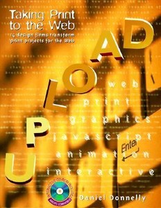
UPLOAD - TAKING PRINT TO THE WEB


I took this book out of the library as the title sounded perfect for my current brief, taking my design and layout from print media online to create Our Happy Place's web presence.

This book features 'fourteen case studies showing how top designers are taking their companies and their clients successfully from traditional print design to interactive Web design.' However, this book was published in 1998 and with the speed that web design is progressing, a book published in 2008 would be considered out of touch.

For that reason I do not feel that I can take much inspiration from the websites showcased within: none of them would even exist in these forms anymore. It seems that in 1998 there were only a few very basic things that could be done online and with very low resolution text and images, whereas almost anything can be achieved in web design and even a novice like myself could create something approaching professional and an expert can create almost anything. This book deals with companies taking their accomplished print designs and trying to fit them into that time's internet templates, and so that aspect won't help me. But surely the ideas remain the same?

In the introduction to the Cosmopolitan magazine case study it is stated that, '"The biggest challenge was making sure the Website was as clear and accessible as the print version," says Cosmopolitan Executive Editor Catherine Romano. "With the magazine, you read a headline, then the deck, and then the lead or the photo captions. We had to make sure that someone perusing the Website would never be confused."'

This corresponds with my web design, as the site must include elements of the visual hierarchy of the Annual Report in order for it to be followed easily and display information in a suitable manner. I feel that I can achieve this by using a similar style to the headings on the website as I did in the report and maintaining the clean orderliness of the text.

I do not feel that there is much else of use in the book, as the case studies themselves are just about the web design itself which is completely outdated and the introductions are often just an introduction into the design company's process and being new to the medium which again is very out of touch now.

Donnelly, D. (1998) Upload - Taking Print to the Web. Gloucester, USA, Rockport Publishers, Inc.

CLIENT FEEDBACK

I sent the Twitter and Facebook mock-ups to my client at 'Our Happy Place', as well as the three designs, and received this feedback this morning:

''The Twitter and Facebook both look fine and I really like how they both continue your ‘annual report’ design throughout giving a recognisable visual consistency to these arms of further communication.''

This was the feedback I expected for these designs, as the annual report design was incorporated into an existing template for the two sites and provides continuity which I like. This gives me confidence that I am on the right track with the designs.


With regards to the  OHP webpage here is my feedback:

1 – This one jumped out at me as my preferred design overall. I really like the simplicity of it and the clean lines and space. I‘m a sucker for simplicity. I also loved how you put the menu in the ‘coloured house’ house icons.

I was a little surprised with this feedback, as I did not feel that my first design was the strongest. I agree that the simplicity is what makes this design, but for me the house icons do not work as well as they could as they seem too large and clunky. However, as the client feels that this is her favourite design I will work on this and make improvements to this existing design.

2 – This was my least favourite design. The border is a good idea but I think makes it too busy over all.

I agree with Francesca Davies that this design is the least effective and included it really as more of a comparison with the others to demonstrate their simplicity. The use of icons I think works well but I do not like the border. This version of the design will not be used.

3 – I do like this one and I agree with you that it combines the best of the previous too but I still feel that top bar area appears too ‘busy’. The bottom two boxes names ‘latest news’ and ‘twitter’ are a great idea but they look like some of the box is missing at the moment.

I was hoping that my client would agree with me that this is the most effective design, but it is a little disappointing that she does not like the house design on either side of the logo. Apart from that it is essentially identical to the first option and so the information shown will be the same anyway.

From this feedback I will adapt the first option and include more elements to that, including expanding the Twitter and Latest News sections and adding a calendar:

One of the major challenges for all our partners is communicating what is on locally so it would be great to have a calendar on the home page to draw attention to ‘what’s on’ immediately – what do you think?

I think the overall look of what you have come up with is excellent and I’m really excited now because you have taken the first step with creating our ‘web’ look. Great work Billy.

Thanks Billy, Fran

This gives me a positive idea of where I am going with this brief and it is reassuring to know that my client likes any of the designs. This is the final design that I will work on and finish up a homepage for in order to fulfil the brief.

WEB DESIGN MOCK-UPS

Deadlines are approaching fast, and I am running out of time to arrange a meeting with Francesca Davies to discuss and evaluate some of the ideas for elements of their website and online presence. Having emailed her to discuss options, I have arranged to have some designs for her to look over at work on Monday morning via email, and hope to receive feedback later the same day. So far I have a few mock-ups finalised and some more that I am currently working on.

This is a design to fit the style of the report into Facebook's template, using the cover design of the annual report as the cover image.

And this is a similar style to use on Twitter, with the multicoloured houses for the background which also incorporates the logo, a blue header background with the houses used again for the profile picture as the logo didn't fit.

This first finalised design for a website draws on the sizing and layouts from the site for the Angel Islington community. I wanted to use the blank white space to good effect, which helps to draw the eye to the most important elements on the page. The 'Our Happy Place' logo is used in large in the top corner of the screen for easy recognition, and the links for the rest of the page are level with that. These are all housed within a coloured house from the front cover of the annual report, which works well with the home link but perhaps I could use the other icons that I designed for the other links. Below this is a welcome message to the website (taken from worcesternortheast.org.uk), as well as a slideshow of images. From my research I have found that most websites of this style use some sort of photographic imagery as a form of welcome and I think a slideshow would work very well in this case. This is all on top of a pastel blue background. To the right is a download link for the latest copy of the Annual Report which would provide more in depth information than the welcome screen should provide. Below these features could possibly be the latest news stories relative to the area or a live blog or Twitter feed.

I think for this initial design stage of the web element I will focus on options for the home screen and navigation, as it will give more opportunity to work on various styles and show the client a variety of options to decide from. For this reason I will look at very different alternatives to this quite functional idea and deliver a wide range to the client.

This next one takes some inspiration from layouts popular with sites like Tumblr and customisable portfolio sites with a large header and emphasis on photography.

This makes less use of negative space, except in the header, and makes more use of the house icons to create a border around the page. Personally I prefer the previous style however. I prefer the purely typographic links to those within the icons, but it's a shame not to use those icons as they could be well suited to links to certain pages. Below this is again the slideshow of images which would be included in any variation, and to the right a larger description of the organisation taken from this year's Annual Report. Underneath that is the row of icons describing the nature of their priorities, and the user can hover over the icons with their cursor to read the information.

There are aspects of each that I would look to take forward into the next design, the minimalism of the first and the layout of the second perhaps.

This combination of the two previous versions is definitely my favourite so far and one that I hope the client agrees is the best option so far. This one keeps the same middle section as the first design, with the slideshow and download option for the PDF mounted on a pastel blue background. It takes the header from the second version, with typographic links and the logo simply on white as I like the minimalist style. I lost the border from the second one as the houses seemed too large and it felt tacky and distracted the eye too much, and instead used a smaller version of the illustration either side of the links and included the trees and flats to break up the monotonous square feel. Underneath there is just a glimpse of the other sections of the homepage, namely the Latest News and a Twitter feed which is how I would continue the design. If I get the go-ahead that I would like from the client then I will expand on this and maybe create other pages that fit in the design scheme.

SITE MAP

I thought of using the map-style cover design as a site map for the website, or even the homepage as I felt that some of the links could be appropriate for this application.

The homepage link would obviously be used with one of the houses, which works well. I also thought that the events link could look good as a banner strung between two trees, while the directory could be used with either a phone box or telegraph poles as above.

COMMUNITY WEBSITES

As the 'Our Happy Place' website will be for a community rather than a village itself, I researched whether there is a difference between the two in terms of web design. I found a directory of London-based community websites, which may provide some answers.

ANGEL ISLINGTON (angelislington.net)


 I really like this page for the Angel Islington area of North London, as it is simple, modern, easy-to-use and aesthetically pleasing. Although they have mixed yellow and green which can look ugly, the shades sit together quite nicely. However, I think it is the layout more than the colour scheme which gives the website an attractive look. It is immediately clear which website you are viewing, with interesting images and a video to watch, as well as a visible link for a business directory. Social media links are also very noticeable, with Facebook, Twitter, Google and Pinterest buttons, and it is the use of space that I really admire, which means that the first appearance of the website is very spacious and clutter-free.

When you scroll down, the page becomes more compact, with links to useful sites and pages down the left of the screen. Next to this is a live Twitter feed which I would definitely look to include within my site, and provides a fantastic up-to-date service for the user.

BALHAM (http://balham.com/)


The Balham website is also very spacious and clean and I particularly admire the use of typography within this example. The photography included is quite grainy, but the simple white colour scheme with occasional highlights of colour makes this a well designed website in my eyes. There is a simple search bar right at the top, and the navigational links are also simply designed and usable. There is a map to explore the area, like I have seen on a few others, and near the bottom of the page are some external links for Facebook, Twitter and Youtube involvement.

I would take forward the simplicity of this design to my own work, and I love the large typography for the title. The 'What's On' section is similar to calendar sections that I have seen, and I like the way it is separated into news for today, tomorrow and days in the future.

BEXLEY WEB (http://www.bexleyweb.co.uk/)


This Bexley Web site is also very simply done but the effect is not the same, and just feels like a Microsoft document. The homepage just features links to sites within the area of Bexley, as well as advertisements which isn't inspiring, although one of the links takes you to their blog which does have social media plug-ins.

ANNUAL REPORT ANALYSIS

Today I was also presented with a printed and bound copy of the annual report.


Overall, I really happy with my designs and it is a great feeling to be able to finally hold my work, and am proud of my achievements with the project. The colours have come out very vibrantly, and although I initially wanted more of a pastel theme to the work they put the 'happy' in Our Happy Place! This also marked the first time that I worked directly and exclusively with a client on a live brief and so it is an important milestone for me. As it was my first time with this sort of work, as well as my first experience of litho printing, there are a number of things that I would edit if I had my time again. There were some issues that were sorted when the proofs came back from the printer, such as a full stop that had jumped, but some slipped through.


One issue that has been raised is the fact that the text is justified left. This was a suggestion by the client, and although we didn't run with her suggestion of centrally justified text, I compromised with left justified. I like the effect that the the lines all start and end evenly, but it has meant that a lot of words are split over two lines and hyphenated. This image shows two lines running where this has happened, which does not look good. If I was able to redo the report I think I would go back to using left aligned lines, although this style above gives the columns a newspaper quality.


All the photographs were sent by the council, and were from many different sources. For this reason, all of the headshots for people involved in the project are in different locations with different lighting. At the time I considered removing the background for each, but some such as Helen Scarrett were photographed in attractive locations so I left them alone. However, in print, the photograph of Neal Murphy from the Two Pennies money advice charity looks very gloomy and I should have edited the contrast on that particular photograph. On the whole it doesn't matter too much but it would have been worth correcting such a basic error.


This page features a snippet from an advertisement for a Who's Who? night where local businesses meet and network. When I cropped the image to fit on the page I found that there wasn't a good place to cut off the poster as any way that I tried you could always see the start of the line below. This has been raised a few times but myself, my tutor and the printer all decided that it was best to run with the report as it was.


I designed 'Volunteer's Hours' badges to display along with the text to show community involvement, and deliberately set them at slight angles to the page as I wanted them to resemble badges that you'd pin on to your coat. However, one student disliked this style when she viewed the work during the peer assessment, but I am happy with the effect myself.

PEER ASSESSMENT

Today was the peer assessment stage of the semester, where students get a chance to view each others' work and suggest improvements. The other students were positive about my work, and especially with the cover designs but they noticed features of the report which could have been improved at the design stage or didn't print as well as could have been hoped. Their main points of improvement were for the web design section of this semester's work which I agree needs to be furthered, and that I should analyse where I felt the printed report went well and where I could have done better.

VILLAGE WEBSITES

I was advised to look into researching village and community websites when preparing to design for the Our Happy Place site, and see how they manage a similar product.

TITCHMARSH VILLAGE (titchmarsh.info)


This website seems to have been constructed using WordPress, as the navigation bar right at the top of the screen seems familiar from the website building software. Below this is the branding for the village website and possibly also for the village itself, which features a hand-drawn/naive style that befits a small organisation or community. It gives the village a quaint and friendly style and is an attractive part of the page, drawing the eye straight in. By the side is a slideshow of images from Titchmarsh, and further down are articles and adverts about local events and news. There is also a ticker below the slideshow which scrolls through some of the latest news, as well as links to social media on the page.

The feel of this website is very cheerful and rural, and I would like to recreate some of the atmosphere generated by the colours, design and typography. The points that I would look to transfer onto a website for Our Happy Place are the slideshow, which can be a powerful tool to bring viewers into the page, and the ticker for latest news which is very useful for events such as road and school closures, but I may design something wherein it is incorporated into a Twitter feed.

LONG MELFORD VILLAGE (longmelford.co.uk)


This website for Long Melford is not as successful as that for Titchmarsh, and seems dated by today's standards, and possibly has remained largely unchanged for over a decade. The background is green, which fills the whole screen with plain colour, with the main body of the website set in white over the top. The first thing that catches the eye is a panorama of the village, but the image is not as inspiring as those shown by Titchmarsh, showing a boring scene on an overcast day. Below this is the main body of the website which is very wordy, but the links on the right hand side of the screen are visible and ensure that the site is easy to navigate. There is an option to like the website on Facebook, with a small button below the photograph, bringing in social media but it is perhaps not used as effectively as possible.

I'm not sure if there are any positives to this website to take forward into designing for Our Happy Place, but it seems functional. It is the sort of website that you would only view for a specific reason, and not one that you would spend any time on. However, it shows that even simple and small websites value social media plug-ins.

PEMBURY (pembury.org)


The website for Pembury is very similar to that of Long Melford, but is a little more dynamic. The background isn't a plain colour but is instead a collage of images with the opacity lowered so as not to distract from the information provided on the site. As well as this, the panoramic header is a slideshow and so more of the village can be shown to the viewer, and the whole page seems a little more modern and you'd want to spend more time on this than the last. Again, social media has been included, but this time it suggests that you follow the organisation on Twitter, and at the bottom of the page there are options to share it via Twitter, Facebook, Google+ and email.

Again, very functional but not an inspiring example of web design.

KINGTON ST MICHAEL (kingtonstmichael.com)


This is a very nineties looking offering, and is an assault on the senses with its confusion of colours, shapes and layouts. I wouldn't want to spend any considerable time on the website, and doesn't seem to add much for the village. This is one example that isn't up-to-date with social media, and has no mention of Facebook or Twitter, which could reflect the age demographic within the village or perhaps that of the designer. I feel that if I were to make a website for Our Happy Place with this style, it wouldn't add anything to the community and so I will avoid any of the trappings here. 

WIGGINTON VILLAGE (http://wiggintonvillage.co.uk/)


I decided to look up my village's website, for Wigginton in Hertfordshire. It is another poor website, although the top navigational banner is like that used by Titchmarsh village, and there is a photographic background to the page. Again, the main bulk of the site is on a white background where the latest main stories can be posted, which on this day is quite a strange cartoon. On the right hand side is a good feature, with calendar entries for the week ahead for all the village's organisations.

I know that Francesca was keen for a calendar page on the Our Happy Place website, and this sort of style could be useful as a simple and obvious way of displaying upcoming events.

WORCESTER.GOV

This is the website for Worcester City Council, that the Our Happy Place site could possibly be incorporated into, worcester.gov.uk


The banner image at the top features some attractive photography, with boxes to allow the user to enter their postcode to find relevant local information and also a search bar. Below that is the header, in the council's colour of bright green which I feel is very overpowering, along with the council's insignia. A lot of white space is used as well, with just touches of bright green which allows the majority of the site to be easy on the eye. In terms of the content, there is a main menu of quick links that are commonly used by council residents such as benefits advice and housing. There are also features, latest news, online links and a map. On the right hand side under the news links there are social media plug ins and links, for Facebook, Twitter, Youtube and an RSS link.


At the bottom of the page there are more external links, including the main Gov.UK parliament site. I find this site quite ugly, as the green is far too bright. The site is also very uninspiring and you don't feel the urge to stay on the website for long, although I imagine it is quite functional, especially with the quick links right at the top of the page. One link directs the user to the Worcestershire Hub (whub.org.uk):


This site brings together sites from the City Council and six local district councils to provide an information point for the whole area. This is also something that the Our Happy Place site could tap into. This follows a similar design scheme to the city website, with the photography and search bars very similar, however the colours are much more muted, with pale purple instead of bright green.

Here, I have designed a banner for an Our Happy Place section on the website, as one of the possibilities of the web element is becoming a subsidiary part of the main Worcester City Council site. For this reason it would have to adhere to certain guidelines, and as the Worcester City Council and Worcestershire Hub sites use the same style header so I developed one for OHP.


I used the house design instead of the floral photography and changed the header background to the pale blue from the report's colour scheme. I superimposed the Our Happy Place logo in place of the previous logos, but the yellow-green clashes against the blue. All in all it is not too bad, and so it could be a viable design.

WEB ICONS

When transferring the style of the printed report to the website, I feel that the main connective part of the design is the coloured house pattern. I also feel that the house icon would make a good home screen button, in the style of that used by Twitter, and set about designing a few more icons that could possibly be used.


These icons could be used for home, calendar, contacts, directory, education, health, services, partners and projects. I rendered them all in the two-tone blue scheme from the report. I am not sure that all of these would be recognisable without typography and so that may need to be added as well.

SOCIAL MEDIA MOCK-UPS

To begin with designing for the internet I decided to mock-up potential pages for social media for Our Happy Place, namely Facebook and Twitter applications.

Facebook
This is a design for a Facebook page for Our Happy Place. Facebook pages are limited in terms of design, with just a cover image and display photo to change. I opted to continue the coloured house design as the cover image as it fits well into the space and provides a cheerful accompaniment to the site, contrasting with the understated standard Facebook design. I used the Our Happy Place logo as the profile picture for obvious reasons, though I wasn't sure how well it would fit into the square available, but I like the effect of the final design due to the negative space.

Twitter
Twitter features a little more editable content than Facebook, with a background image as well as a header and profile picture. I tried to maintain the same theme as the Facebook version and merely tweak it but I found I had to make a few changes. The coloured house design again takes precedent and in this case is used as the background, but I found that the Our Happy Place logo didn't suit the small size needed for the profile picture due to its shape. For this reason, I moved it into part of the background and used the identifiable houses as the user icon image. I used blue for the header colour as that is the main part of the colour scheme in the printed report.

TO PRINT

This week the report will finally be going to print, and my final report was sent off to the printers. I learnt more about InDesign with this process, as I readied the work to be printed, as I had to package the file with the links to photographs included. There is a simple way to complete a task that seemed daunting, with a couple of simple steps to create a folder of all the files needed.

I was able to view the proofs that came back from the printers to check over the pages and ensure everything was as it should be. There were a few points to sort out, one being the justification of the text columns for which I had to compromise with the clients to create a look we both liked. The printer was unsure about the amount of hyphenations but as the clients had signed off the document this was left unchanged.

In a couple of places on the design there were elements that had been accidentally moved when the designs were edited or resized, which meant that one spread has to be resubmitted to the printer when amended, and the back page that the operatives at the printing press can correct.

Seeing the proofs for the first time was a great experience, which has taught me more about the printing process. I was disappointed that the report wasn't perfect for the printers but I'm glad that the changes were spotted at this stage rather than after the print run. With any luck, I will also be able to attend the printers when the final copy goes to press and witness the process first-hand.

Annual Report Update

Since the meeting, the work on this brief has entailed bringing the annual report closer to completion so that we can get that signed off and begin to concentrate on the accompanying website. One of the main problems with the report as it was at the stage of the meeting was the number of pages, which at the time was 22. In order for the printers to bind it like a book it had to total 20 or 24 pages as they are multiples of 4, otherwise there would be two blank pages. Francesca Davies was more keen to add a further two pages of content than reduce the report as there were articles available to use, and so this was the approach taken.

As she was due to leave on holiday at the end of that week, she spent Wednesday collating extra content and we worked all day on Tuesday and Friday amending the report. We achieved this by working remotely and communicating the changes via email, a system that worked very well and allowed simple communication of some complex changes.

The final version from that Friday night was then distributed to Claire Neville as Francesca Davies left on holiday, and she had until the following Wednesday to outline the changes she would like to see, which she then emailed to me, and were completed the next day. As she too had holiday time booked my latest correspondence has been with Rob Byrne, and the final amendments are now in place and hopefully won't change again before it's sent to print.

The Changes


The cover remained the same for a long time, and has only been changed in the past few days, as one of Claire Neville's requirements was that 'Our Happy Place' takes centre stage, with the word 'project' removed. I was a little unsure about changing this as I felt that the previous cover looked more balanced with the type colour and sizing but the final result doesn't lose too much.


The inside cover features the same illustrative style, which I am glad about as if we had reduced the report to 20 pages this would have been lost, as would the balance of the report. The only change here is a more rounded style to the thick blue band which is there to represent the River Severn, as I feel it is a more organic shape and softens the image.

The contents page features the same minimal style with a simple title and the house icons for page numbers and the footer which remains throughout the report and provides the iconic visual style, as well as the two-tone blue shades which are also used extensively throughout. The changes are more items on the contents page, and some of them have been renamed by the clients. The Volunteers Badge was added after the module hand-in, and the explanatory text for the hyperlinks is new too. I designed the badge to fit in with the style of the report, and used a simple V icon in white and a two-tone background which in this case utilises the reds from the cover.

I had placed the explanations for the Volunteers Badge and the hyperlinks in the bottom right corner of the page, away from the Contents to show that they are separate. However, the clients were keen on moving these to their current place which I feel doesn't make such good use of the space. This is one of the few places in the report where we disagree, and I don't mind settling on their placement here.


The photographs are finally sorted, so I could see the final design of the pages and whether I'd left enough space for the photography that they wanted to include. The page with the Foreword looks good, though maybe doesn't fill the space as well as the placeholders that were in the version I handed in.

The alignment of the text has changed a few times throughout the report. Originally all the text was aligned left, and I would manually edit the lines if there was a hyphenated word across two lines to ensure all words were seen whole. Francesca Davies asked if I could consider changing the alignment to a more newspaper-style column style for which I justified all the lines centred, and while she thought some areas looked better (and I agreed), for some lines it didn't work. However, I decided to compromise and justified left all of the text which although creates some hyphenated words, it also gives the columns a professional and square look and on the whole I prefer it.

In this case, both photographs have high resolution and are large enough to fit within their spaces, which has caused problems elsewhere.


The left hand page has been largely untouched, with just subtle changes to the infographics such as the titles and the key, but it does feature some links. I decided to make these blue to stand out from the rest of the text and also fit in with the main colour scheme.

The page on the right is one that was added after the meeting, with the results from a recent residents survey. I was worried when Francesca said that she wanted to add another two pages as there wasn't a lot of time to create a page and I wasn't sure how much input I'd have to add. However, I found that it was easy to fit in and has become one of my favourite pages in the report, and allowed me to create a couple of small infographics which I enjoyed.


These pages are essentially unchanged, although they were not previously part of the same spread. The only real change is on the 'Health' section, with the removal of the UK map which I agree was a little confusing and was only in there as there was an empty space with no text or photography. Now, there are another few paragraphs which fills that space, and also led to me having to rearrange some elements which was quite difficult. I am quite happy with the final look of this spread, though it appears a little cramped and confusing in places.


The page on the left about 'Young People' and 'Crime' has undergone a few changes, with the addition of more text and the removal of some of my least favourite infographics. This has led to a very balanced and attractive page which I am very pleased with. The paragraphs are paired in columns with similar sized ones which has led to a very structured style.

The 'Partnership' page features the same gridded structure that I designed for the hand-in, and works well with the photographs that were submitted to me. I remember struggling to design the layout for this page initially, before finding that the simplest solution worked best in the context. Overall, I feel that this spread is one of the best in the report, for its balance and structure as well as showing the full variation of elements that have been included in this report.


The 'Local Priorities' infographic was removed entirely and was replaced by an explanatory blurb, although the icons I created are still used in the headings for the Priority stories. These pages have undergone huge changes since the version that I submitted for university, and are almost unrecognisable in subject matter and appearance. Therefore it is difficult to give an accurate comparison, though one big change was the addition of quotes in the articles, for which I created speech bubbles which fit in with the colour scheme and show the views of the residents.

The photographs used in these reports have also helped with the colourful nature of the report and added a human element.


These pages have a very similar style and are very text-heavy so I wasn't able to give much of a creative spin to the design but I feel they look professional and wouldn't be out of place in a magazine so I am happy with how they have turned out. They have undergone many changes but those were almost entirely in the articles themselves, and so it hasn't been too difficult for me to edit them when necessary although it has been difficult in places to stop it looking cramped.


The conclusion has changed a little, with the addition of another paragraph from another Councillor, and photographs and logos for each. This has led to me moving the logos of contributors to the inside cover, where I have also been asked to add a blurb about the University's, and my own, involvement in the design of the report.


Finally, the back cover features an unedited version of the illustration, which I feel will create a very nice effect when this is sent to print and will be iconic and easily recognisable.

Once this is finally agreed and sent to print I will be able to look more closely into the web design element of the brief. I feel like the visual identity of this report should be brought across into it, but I currently am not sure how that will be achieved. I feel that house icon would make a nice 'Home' icon on the site, and maybe different ones could be created for the other pages with elements from the other infographics within the report.